This is the fourth and the last part of a full pipeline [Exploratory data analysis, data cleaning and preprocessing, modeling, error analysis]. I recommend reading the first, second, and third parts first.
Full project with data is available on my github
#importing libraries
import pandas as pd
import numpy as np
import seaborn as sns
import matplotlib.pyplot as plt
import plotly.express as px
from matplotlib import pyplot as plt
plt.style.use('seaborn-dark')

import os
Import predictions
results_XGB = pd.read_csv('results_XGB.csv', header ='infer')
results_LGB = pd.read_csv('results_LGB.csv', header ='infer')
results_KNN = pd.read_csv('results_KNN.csv', header ='infer')
Let's plot results of all 3 models
cmap = sns.cubehelix_palette(dark=.2, light=.8, as_cmap=True)
plt.rcParams["figure.figsize"] = (16,10)
ax = sns.scatterplot(x = 'rent_price', y = 'predictions_knn', palette="Set2", sizes=(200, 20), hue_norm=(0, 7),
                     legend="full", data = results_KNN)

cmap = sns.cubehelix_palette(dark=.2, light=.8, as_cmap=True)
plt.rcParams["figure.figsize"] = (16,10)
ax = sns.scatterplot(x = 'rent_price', y = 'predictions_lgb', palette="Set2", sizes=(200, 20), hue_norm=(0, 7),
                     legend="full", data = results_LGB)

cmap = sns.cubehelix_palette(dark=.2, light=.8, as_cmap=True)
plt.rcParams["figure.figsize"] = (16,10)
ax = sns.scatterplot(x = 'rent_price', y = 'predictions_tuned_Xgb', palette="Set2", sizes=(200, 20), hue_norm=(0, 7),
                     legend="full", data = results_XGB)
plt.title('Predicted & Real by KNN, LGB, XGB')
ax.set(xlabel='Real', ylabel='Predicted')
plt.legend(title='Models', loc='upper left', labels=['KNN', 'LGB','XGB'])
plt.plot()
plt.show()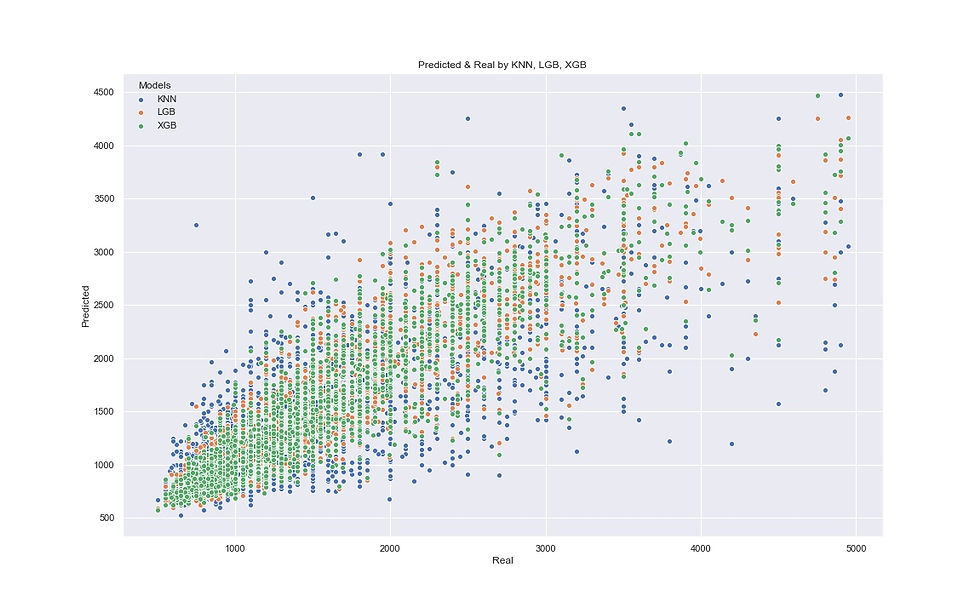
XGB (green dots) has a smoother shape and, therefore, has better predictions. The second is LGB (orange dots) and KNN (blue dots) is the worst, its shape is the widest and it makes more mistakes.
Since XGB is the best model, I will continue my error analysis with XGB predictions. The plot below shows in which clusters the model gives accurate predictions and in which - not.
#Residuals distibution by neighborhood groups (0-8)
sns.set(color_codes=True)
plt.rcParams["figure.figsize"] = (16,10)
ax = sns.lmplot(x = 'rent_price', y = 'predictions_tuned_Xgb', hue='Neigh_cluster',
           col="Neigh_cluster", col_wrap=3, data = results_XGB, x_jitter=.05)
plt.savefig('images/Residuals_XGB_groups.jpg')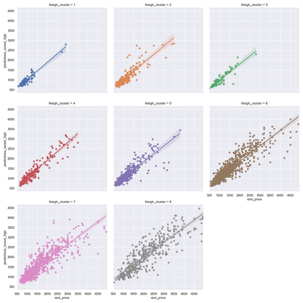
Compare predictions with relative residuals of lower than 10% and higher than 10%. First, I will store these observations in 2 dataframes for comparison.
eval_less_10 = results_XGB[results_XGB.resid_percent_Xgb<10]
eval_more_10 = results_XGB[results_XGB.resid_percent_Xgb>10]
plt.figure(figsize=(16, 10))
sns.distplot(eval_less_10.sq_mt_built, color="g", kde=False)
sns.distplot(eval_more_10.sq_mt_built, color="r", kde=False)
plt.ylabel('Density')
plt.title('Model mistakes by square meters')
plt.legend(title='Errors', loc='upper right', labels=['less than 10%','more than 10%'])
plt.savefig('images/Model_mistakes_sq_mt_built.jpg')
plt.show()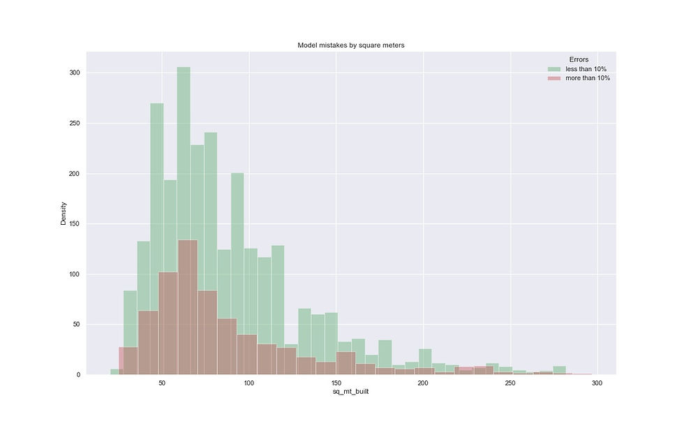
The model makes very accurate predictions on listings where the square is between 75 and 120 m2.
#Error analysis by rent price
plt.figure(figsize=(16, 10))
sns.distplot(eval_less_10.rent_price, color='g', kde=False) #Errors less than 10%
sns.distplot(eval_more_10.rent_price, color='r', kde=False) #Errors more than 10%
plt.ylabel('Density')
plt.title('Model mistakes by rent price')
plt.legend(title='Errors', loc='upper right', labels=['less than 10%','more than 10%'])
plt.savefig('images/Model_mistakes_by_price.jpg')
plt.show()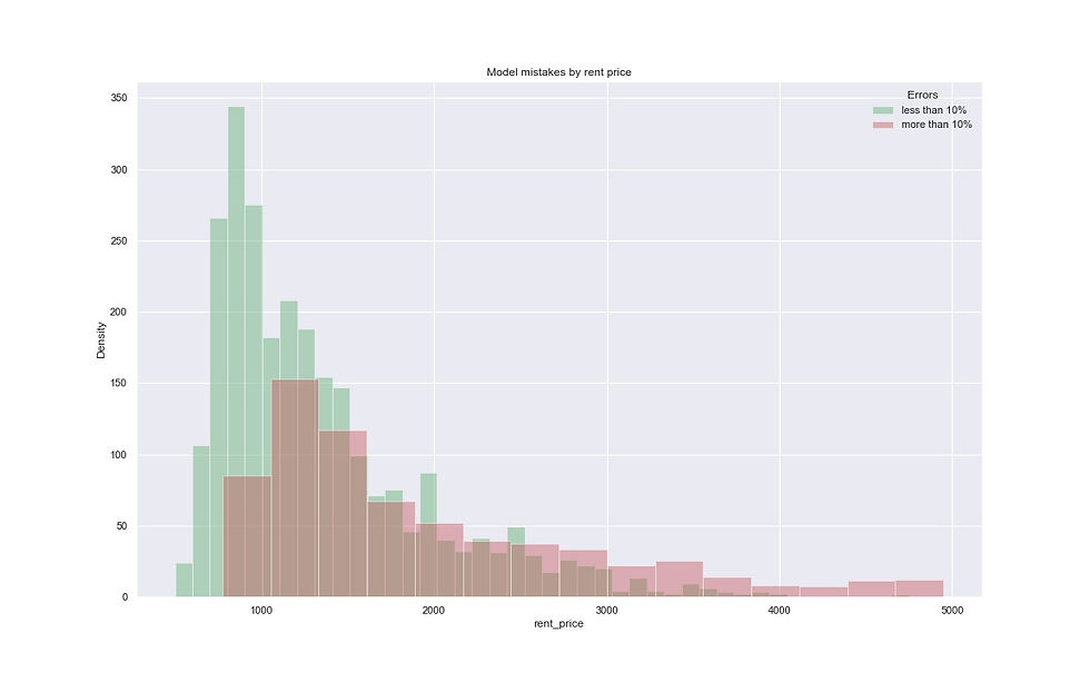
The model makes very accurate predictions on listings under 1000 euro.
#Error analysis by number of rooms
plt.figure(figsize=(16, 6))
sns.distplot(eval_less_10.n_rooms, color="g", kde=False)
sns.distplot(eval_more_10.n_rooms, color="r", kde=False)

plt.ylabel('Density')
plt.title('Model mistakes by number of rooms')
plt.legend(title='Errors', loc='upper right', labels=['less than 10%','more than 10%'])
plt.savefig('images/Model_mistakes_n_rooms.jpg')
plt.show()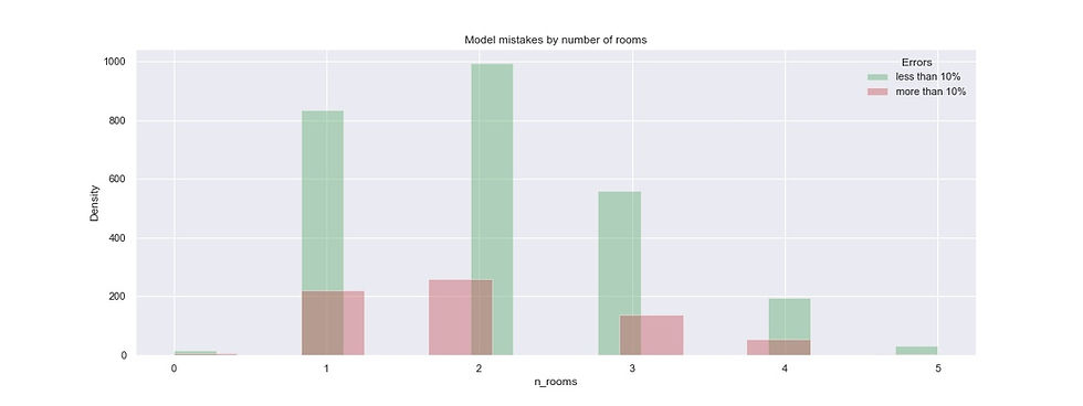
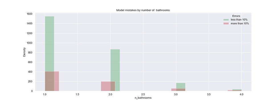
#Error analysis by number of bathrooms
plt.figure(figsize=(16, 6))
sns.distplot(eval_less_10.n_bathrooms, color="g", kde=False)
sns.distplot(eval_more_10.n_bathrooms, color="r", kde=False)
plt.ylabel('Density')
plt.title('Model mistakes by number of  bathrooms')
plt.legend(title='Errors', loc='upper right', labels=['less than 10%','more than 10%'])
plt.savefig('images/Model_mistakes_n_bathrooms.jpg')
plt.show()
#Error analysis by Neighborhood clusters
plt.figure(figsize=(16, 6))
sns.distplot(eval_less_10.Neigh_cluster,  color="g", kde=False)
sns.distplot(eval_more_10.Neigh_cluster,  color="r", kde=False)
plt.ylabel('Density')
plt.title('Model mistakes by clusters in Neighborhoods')
plt.legend(title='Errors', loc='upper right', labels=['less than 10%','more than 10%'])
plt.savefig('images/Model_mistakes_Neighborhoos_groups.jpg')
plt.show()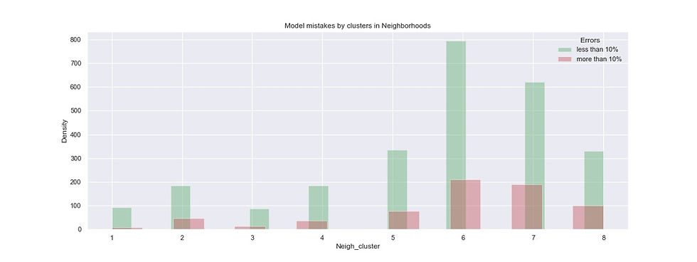
Conclusions:
In general, the model is doing well with predictions, but there is always room for improvement. I will move on to feature engineering part and use street_name column and create a new feature - is_main_street (1/0). My assumption is that the rental price for houses on main streets is higher than for those on secondary or smaller streets.
Best practices of error analysis recommend to find Errors, create hypothesis for what could fix the errors and test the hypothesis. If nothing works, then repeat.
Comments